Bee on Time
Bee on Time is a mobile website aiming to improve and increase meeting and event attendance by creating a central platform where members in a group can schedule events, invite others, and bet money on attendance for it.


Client
YJ
Role
UI Designer
Duration
10 weeks
Problem
For my IN4MATX 151 course project, I teamed up with other student designers to work on UI design for YJ, a group of students whose web application needed design work. The client required design assistance for their new website, Bee on Time, a product that would allow users to incentivize others in attending scheduled meetings on time by putting money on the line. While the functions and platform for the website were well defined already, the startup lacked the skills necessary to design the graphics and UI of the website. Without the UI established, the team would be unable to proceed to developing the front-end.
Solution
In order to properly transform their ideas to visuals, my team of fellow student designers and I were tasked with designing the wireframes and mockups of the website's main pages. By maintaining a consistent and thorough communication with YJ, and establishing mutual understanding of Bee on Time's functional and visual requirements early on, we developed a fun UI that was fitting of our client's needs.
Sketching
Many of the features and requirements for each page of the app were roughly defined by the client prior to the beginning of the project, so clarifying these requirements and building our designs off of them was our main task as the design team. We decided to split work on the pages amongst the members and I was responsible for designing the app's "History" page and sidebar.
I started the process by sketching what the features would look like based on the provided requirements. Since the client wished for the design to stay true to their requirements, I focused on making the UI simple and easy to understand/recognize, and refrained from adding details or features that weren't mentioned in the documentation.
Requirements Doc


Sketches
Wireframes
To take my sketches to the next level, I used Figma to design their wireframe counterparts, adding new ones to account for changes in UI when a user interacts with a feature.
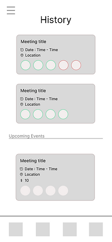
History Page
Users should be able to view events or meetings that they've attended in the past, as well as upcoming ones. In each event, they're able to view details in a glance. To ensure this, I had the events compartmentalized with their own brief details.
Event components include:
-
Title
-
Date and time
-
Location
-
Money betted (if upcoming)
-
Profiles of the attendees invited and their color - coded results of attendance.
-
Red - failed to attend.
-
Green - succeeded to attend.
-
Sidebar
Through the sidebar, users can visit other pages on the app, view and charge in-app currency used for events, and sign out of their account. Similar to how I organized the events in the History page, I separated the profile picture, currency charge, and other pages into distinct sections. The succession of wireframes below represent what the user will see when charging currency.

Sidebar - View currency and other pages

View charge options


Warning pop-up when a charge option is selected
Mockups
After my team and I had sent our wireframes to YJ for feedback and approval, we moved onto applying a honeycomb color palette and font to ensure that the app would embody the desired cute aesthetic and match the name of the app.
.png)

.png)

Interactive Prototype
Although we were initially tasked to work up to the mockup phase, we were further requested for a prototype. As per YJ's request, we combined our work together and created an interactive prototype that would display how a user might interact with some of the vital features of the app.
-
Creating an event
-
Inputting event details
-
Voting to cancel an event
-
Viewing the results of how well everyone attended the event
-
Choosing how much to charge in the sidebar
What I Learned
During this project, I learned some considerations that may follow when working closely with a client. For example, one of them was maintaining consistent communication and approval as it allowed me to ensure that YJ's requirements were clarified and that my designs would produce a useful final product. It was also important to react well and adjust to unexpected scope creep since the client's requirements had expanded near the end of the project. I hope to keep these considerations in future work with clients.
