Languini
Languini is a mobile app that offers interactive fact and language learning lessons tailored to each recipe, ensuring that every cooking session doubles as a cultural learning experience.

Design at UCI's Winter 24' Project Teams
1st place winner
People's Choice


Client
Design at UCI
Role
UI/UX Designer
Duration
10 weeks
Context
This project was part of a program provided by the Design at UCI club, called Project Teams. In this program, students form teams to work on a design project surrounding a common theme. At the time of my participation, the theme was food, and my team decided to combat the problem of college students feeling disconnected with their culture by teaching them to cook and learn at the same time.
Problem
solution
In a time where the celebration and understanding of diverse cultures is important, today’s fast-paced lifestyle leaves students and non-students alike lacking in time to learn how to cook for themselves and develop a connection to their cultural identity and the people around them.
To cultivate the bond between students and their cultural identities, our solution is to design a platform promoting the learning of language and culture through an activity rich in both: cooking.
Languini allows for a cultural learning experience in the process of cooking dishes by incorporating simple and interactive activities that teach both facts and common words or terms related to the cultural dish.
Research
Survey
Our team sent out a google form to better understand college students' current relationship with their culture and ascertain their experience with cooking foods from said culture. We obtained 60 respondents where a majority of them were college students.

46.7%
Nearly half rated their connection to their own culture a 3/5
56.7%
Half have shown a strong interest in learning languages from their own or other's culture

Findings
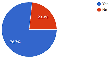
23.3%
However, some don't know how to cook foods from their own culture
Interviews
We furthered our understanding of the target audience by conducting 10 interviews with some of the survey respondents, expanding our inquiry to their opinions and preferences on online applications catered to recipes and/or language learning.
In my interview with one of the responding college students, I found that they...
Cooking Experience
-
Learned to cook some cultural foods by watching their parents cook.
-
Has little experience in cooking traditional cultural meals, and doesn't have time to cook very often in general.
Recipe Apps/Websites
-
Favor simpler recipes with shorter cooking times.
-
Chooses recipes based on images and thumbnails.
-
Prefers step-by-step instructional videos that they can refer to when cooking.
Language Learning Apps
-
Find streaks and leaderboards burdensome.
-
Enjoy rewards for completing tasks.
These findings were commonly found in other team members' interviews, leading to our next step: gathering our results. We analyzed our results through affinity mapping, where we categorized them into common themes surrounding people's overall interest in culture, their preferences for features of both recipe and language learning platforms, as well as their likes and dislikes. My teammates and I made sure to consider these observations when designing the product.
Affinity Mapping
.png)

An important theme that I had observed in our interviewees were that many of them and the respondents preferred some form of motivation beyond streaks to keep learning. To allow the app to engage its users, a reward system where stickers are rewarded based on the user's recipe completion was incorporated.
Additionally, the audience's dependency on images when browsing recipes influenced me to design the app's recipes to be more visual-focused and informational at a glance.

Competitive Analysis
It was important to be aware of similar apps in the market and what features they offered to their users. In our competitive analysis, both language learning apps and recipe sites were compared to understand the key features they most commonly use.
My Analysis : Duolingo

In this phase of the project, I analyzed Duolingo, a popular language learning app that teaches people how to read, write, listen, and speak various languages. During my analysis, I took the time to download the app and use it myself, taking note of the features we could incorporate for the language learning aspect of our app.
From my observations and brief experience using the app, I found that Duolingo was very much gamified, utilizing classifications for different skill levels and providing a variety of rewards, streaks, and daily tasks to incentivize learning retention and routine. A simple level of onboarding, language learning exercises, and rewards were considered for Languini's design.
Key Features
-
Onboarding process inquiring user's language proficiency.
-
Rewards and daily tasks as incentives.
-
Visualization of learning progress through roadmaps.
-
Learning exercises that included reading the language, putting together sentences and providing their meanings, and listening to pronunciation audio.
-
Completed lessons to review.
Compiled Analysis
After everyone had done their own analysis, we compiled our observations into one table. The main features we used for comparison were onboarding, skill level options, recipe ratings, progress tracking, recipe descriptions, and account systems. These same features were kept in consideration for Languini's functionality and design.

has feature
does not have feature
DEsign
Sketching
I began sketching screens for the app, focusing on visualizing and ideating key features that we wanted to implement. As I wanted people to feel a little more connected to the cultures they're interested in and be able to find that connection within our app, I came up with an idea for recipes to be marked by country flags based on their origin, as well as include simple language learning cards in the cooking instruction. Through these design choices, people will be able to search for meals from specific cultures and expand their understanding as they cook.
My vision for the app included pages for...
-
Logging into user's account.
-
Browsing the home page for recommended cuisines and recipes.
-
Viewing an overview of each recipe and their required ingredients.
-
Starting the recipe's step-by-step cooking instruction, incorporated with fun facts and language activities in between.
-
Accessing user's "Cookbook", a collection of completed recipes.

USer Flow
In the transition from sketching to wireframes, we noticed that many of us had varying visions for the app's features. To resolve this, a user flow was required to establish a mutual understanding amongst ourselves of how the user will go about the app.
The main flow consist of these steps:
-
Login with existing account / Complete onboarding as new user.
-
Search for recipes via Home page.
-
View recipes from search results.
-
Select recipe and begin step-by-step instructional learning.
-
Receive rewards and review learning upon instruction completion.

Wireframes
Transitioning to wireframing, I designed pages for the Home page and the search feature used for finding recipes. These lo-fi wireframes display basic layouts, icons, and placeholder texts. As mentioned in the user research, certain information about recipes were essential to people's positive experiences with recipe selection. To incorporate them in the app, I made sure to present recipe images first with additional information such as user ratings and total cooking duration.
Home page

Search bar
Continue recipe from before
Slider of recommended recipes
Cuisine recommendation with recipes
Sliding Filter
Search options


Save recipe
Recipe's cultural origin
Recipe details
-
Rating from reviews
& Cooking time
search results
Searching for a recipe
BRanding
For our app, we wanted to convey both the language learning and cooking aspect of the product, so we decided on the name,"Languini", a combination of words "Language" and "Linguine". Duolingo is well known for their memorable owl mascot, Duo, so it felt imperative for the team and I to create our own mascot to motivate users' learning and connection with Languini.
Meet Lini!

Fonts and Color Palette
Originally, the color palette was going to be blue and yellow as blue was the complementary color to Lini's yellow design; however, like many others, I have felt that the color pairing lacked the excitement and energy we had envisioned for Languini. Noticing that red is a commonly used color for food apps and evokes appetite, I advocated for warmer tones in the color palette and Montserrat to be our main font.


High Fidelity Mockups
The aforementioned fonts and colors were incorporated to create hi-fi mockups. In these mockups, I replaced placeholder boxes with real images of cultural dishes, and dummy text with real text.


testing
Usability TEsting
During the testing phase of the project, I participated in 2 of the 6 usability testing sessions that we had with college students. I made note of the testers' interactions with the app, as well as what went well and what didn't.
Test #1
Test #2
Tester found the app's design intuitive and easy to understand.
Tester was able to easily navigate tasks from exploring the Home page to viewing recipe information.
One difficulty that the tester experienced were checking off cooking tasks in the learning session as the checkboxes were too small.
Tester felt the onboarding asked good standard questions.
Tester felt they would forget what ingredients were needed for each step of the cooking session.
Certain features were not immediately visible to them, such as bookmark buttons to save recipes.
Iteration
We made a list of details that could be improved, and I took the lead in making certain features more visible and comprehensive. For instance, a team member observed that one of the testers thought the unsaving of a recipe in the saved recipes section of the app was a bug. To make it clear to the user that they had just unsaved a recipe from their list, I added a notifying popup that a recipe was removed as well as an undo button. In addition to this, I made subtle changes such as making the saved buttons slightly bigger.


Prototype
Click here to get started!
Reflection
Working with dedicated and thorough team members, I was able to learn and dive deep into each phase more extensively than before. In the research phase, I learned to conduct interviews and summarize my findings with the team. For the design aspect, I became more familiar with Figma's prototyping features and have attained an even greater motivation to explore its capabilities.
While our app was regarded very well by both the mentors of the program and our peers, there were some things I could improve on in the next project.
-
Creating personas would've helped narrow down our target audience and improve the app's design in catering to their needs. I realized later on that our app didn't just cater to students, but to people who want to learn cultural foods in general.
-
Taking more time to think about the app's branding could've prevented some iterations on fonts and colors.
